
Lodging Redesign
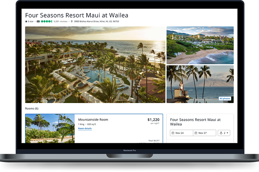
Chase Travel is a travel booking platform where Chase cardholders can book flights, hotels, cars and more using their credit card or rewards points. Our design challenge was nothing short of transforming Chase Travel into the ultimate one-stop destination for planning and booking trips. We aimed to empower users to dream big and book with ease, whether using their points or their card. I played a key role in owning the lodging shopping path within this comprehensive redesign. Collaborating with a talented team of UX designers, content designers, researchers, and key stakeholders, we crafted a cohesive, end-to-end experience that has since launched at chasetravel.com. The result? A 20% increase in hotel bookings year-over-year and a 3% increase in cash bookings versus points bookings, proving the success of our strategy to enhance both usability and customer engagement.


The Opportunity
How might we transform our platform into a go-to destination for users to book their trips, rather than simply a tool for redeeming points?
Specific goal
Be the go-to place to book travel
Key metrics
-
Increase in cash mix
-
Increase in bookings
-
Increase lodging attachment
My Role & Team Collaboration
As a UX designer, I collaborated with a diverse group of stakeholders throughout the project to ensure a customer centric and feasible solution that meets business objectives.
Understanding the Current State of Chase Travel Lodging
My focus area
The Chase Travel booking flow starts at the travel hub, where users can begin their search. From there, they move to the search results page, where they can explore options, followed by the product details page for more in-depth information. Finally, they proceed to the cart to complete their booking.

On this redesign project I had ownership of the search results page and product details page.
Today's search page is cluttered and overloaded with information.
The lodging search results page lacks inspiration and fails to encourage exciting exploration. It’s cluttered with a prominent marketing banner, while exposed filters and redundant search fields take up valuable space. The result cards themselves feel overwhelming and chaotic, detracting from the user experience.

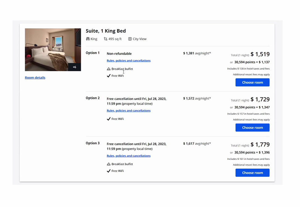
The product details page is repetitive and lacks clarity.
The room cards on the product details page make it challenging to distinguish between the different rate options and the image is too small for users to assess the room.
Research & Discovery
Exploring both within the travel industry and beyond.
I drew inspiration from sites outside the travel industry that showcased products with numerous options presented in a streamlined and easy-to-navigate way. Additionally, I explored other travel sites, gathering both creative ideas and insights on potential pitfalls to avoid. I learned that balancing simple, intuitive navigation and clear, compelling visuals is essential for a successful travel site, even when managing complex offerings.

UX researcher collaboration
I collaborated with a UX researcher to help inform our redesign. 15 user interviews were conducted to help us determine the following:
-
Jobs to be done on each surface
-
Ideal state of surfaces
-
Aligning customer and business priorities

Insights from user interviews
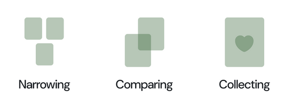
On the search results page, travelers need help narrowing down options, comparing properties and collecting their choices. High-priority information includes:
-
Desirability: What stands out about this hotel? (Reviews, images, unique features)
-
Location: Where is this hotel in relation to points of interest? (Strong preference for a visible map interface)
-
Value: Is this hotel worth the price? (Price, star rating, list of benefits, and reviews help assess value)
On the product details page, travelers want to validate their choices, resolve doubts and ultimately select their final optioin. High-priority info includes:
-
Amenities: Does this stay offer what I need? (Amenity list, essential services)
-
Vibe: What’s the feel of this stay? (High-quality images are crucial here)
-
Reality: What’s the true cost and policy? (Final price, cancellation terms, room availability)
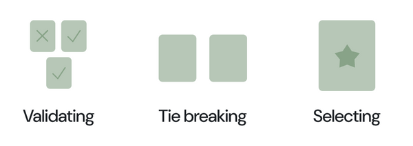
After business and customers ranked attributes that are important to them we identified 8 key elements that are important to both customers and business partners.
-
Gallery of images
-
Carousel of images
-
Price
-
Property name
-
Link to map
-
Price in points
-
List of benefits
-
Button to proceed to details page
Iterating & Refining Through Collaboration
UX team collaboration
Held collaborative design sessions with team members in my line of business and across other lines of business to refine designs.
Tech feasibility
Participated in weekly check-ins with the tech team to ensure the feasibility of designs early in the process.
Content design
Worked closely with our lodging content designer to implement a mental model we developed together, based on an analysis of other travel sites, to inform the page structure.
Collaboration with design systems team
A unique challenge I faced was that the design systems team was still building out the refreshed design system that aligned with the Chase Travel rebrand that would launch with our redesigned site. I built out all of my designs using a wireframe component library and collaborated with the design systems team when I needed unique components for my surfaces.

ADA compliance
Reviewed all designs with the ADA design team and created detailed greenlines to ensure compliance and proper implementation of accessibility standards.
Final Designs
Travel, reimagined
The final designs are the result of deep customer insights and close collaboration with stakeholders. What was once an overcrowded, uninspiring site has transformed into a seamless, engaging experience - making it effortless to shop for and get excited about your next trip. Explore the full walkthrough from the search results page to the property details page.

Key features
New key features transform the experience and make travel planning effortless. Explore them below.
Smart filters
Filters are easily accessible when needed, ensuring a seamless browsing experience. A dynamic results button updates in real time, preventing users from accidentally narrowing their options too much.
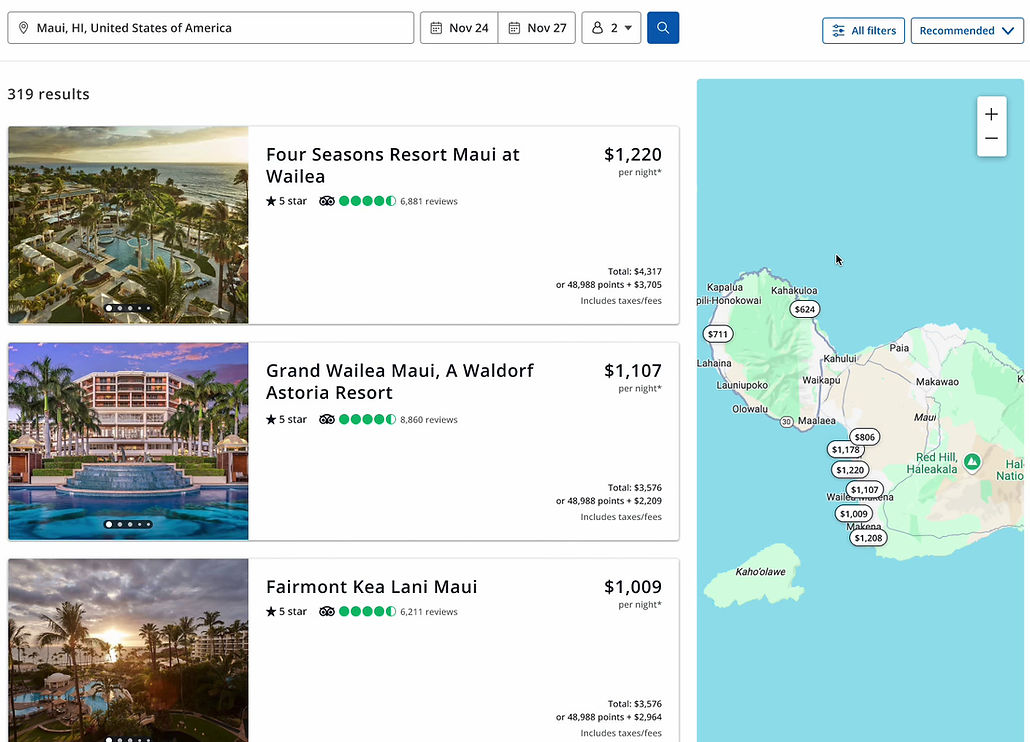
Interactive map
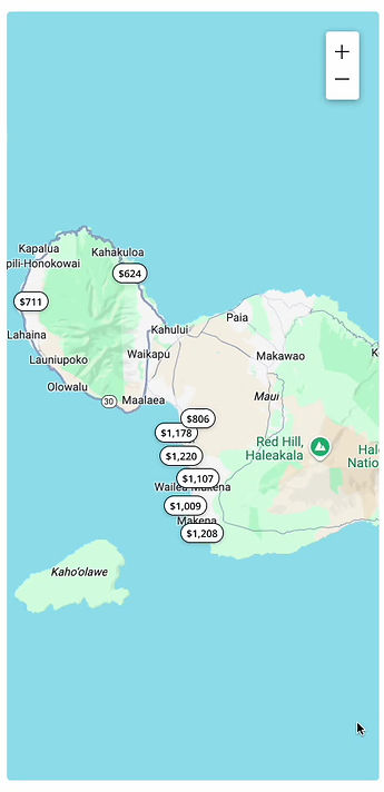
Originally, the map was hidden behind a button, but customer insights revealed location as a key booking factor. Now, an interactive map lets users effortlessly explore and find their perfect stay.
Rate options, simplified
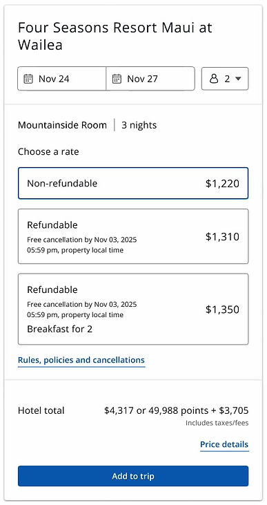
In this redesign, we introduced a new feature called the Commerce Rail on the product details page. By consolidating room rates into this streamlined component, we’ve made rate selection more intuitive and effortless.
Hero image gallery and carousel
Images play a crucial role in helping users assess whether a property matches the vibe and meets their needs for their trip. To enhance this experience, we've introduced a spacious hero gallery at the top of the page, offering an immediate sense of the property's atmosphere. Users can also explore additional images through a grid gallery or a full-page carousel for a larger view.

The Results
When our site-wide redesign launched, it delivering measurable impact. Chase Travel Lodging saw a 20% increase in booking volume YoY and a 3% rise in cash bookings over points, driving greater revenue and engagement.
Check out the ad that went live with our redesign launch.
